Digital Captive

Tuesday, October 31, 2006

Creating a Theater Ad That Pops!

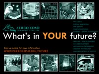
One of my recent projects was to create a marketing ad to be displayed in a local theater for the vocational programs at Cerro Coso College. The ad entices viewers to visit a web page to sign up for more information about the programs. This web page collects requests for more information through a form and provides links to the various program sites. The page collects the number of hits received. There is a redirect page for each program page that also collects the clickthrough's so that we can capture the number of hits for each program through the site. The ad was created in Photoshop, saved as a jpeg, and the companion page was done in FrontPage.

With this ad I wanted to design something where the main tag line “What’s in YOUR future?” would really pop. Since the theater itself is usually dark when the slides are being displayed, I used the black environment and a reduced color palette to create a subtle design where the primary text jumps out against the expanse of black of the entire screen. Using monotone pictures helps the text to jump out, and keeps the visual collected. If all of the photos were in full color the pictures would be visually distracting and pull the attention away from the text, which is where we want our viewers to focus their attention. Since the ad is displayed for a considerable length there is time for the viewer to explore the visuals and review the list of programs after reading the initial text.

The companion page uses a very similar design, pulling from the same color palette as the ad, to bring continuity to the overall package. Using a thumbnail of the ad helps the viewer to clearly identify that this is where they want to be. Tying the designs together, instead of using the standard college website interface, brings a higher sense of professionalism and visual continuity to the entire package. Using the program visuals in the ad to serve as links to the program websites is a good way to make visual connections with the programs. These graphics, also used in other marketing materials related to occupational education, help to establish connections with the programs and the other materials that viewers may already be familiar with, helping to strengthen the branding. Overall, a pretty enjoyable and quick project.

Monday, October 23, 2006

IT Salary Guide for 2007

A new article from one of my favorite e-zines, e-Week, provides some salary projections for 2007. The good news is that starting salaries in IT are expected to increase an average of 2.8% in 2007 (from 2006) and up to 4% in high-demand areas, such as Web development and data warehouse management. It appears that the “Web-ification” of the world as it is referred to in the article, is driving the demand for Web developers, with projected salary increases of 5.1% ($60,250 to $94,750) in 2007. It’s basically an overall good time to be working in the IT world, but with more and more services and products going online or making use of the Web, this is a great time to be in Web development.

Learn more about the 2007 projections and some of the most coveted IT skills by CIO’s through the e-Week article, Cha-Ching! The First 2007 IT Salary Guide Arrives.

Salary information and projections are according to the 2007 IT Salary Guide from Robert Half Technology, to be released Oct. 24.

Monday, October 16, 2006

Metamorphoses, a journey in redesign

I had an opportunity recently to do a redesign of the Metamorphoses website. Metamorphoses is a literary and art journal produced collectively by the English and Art departments at Cerro Coso Community College. The site owner, Gary Enns, said he wanted something more modern, more along the lines of the San Francisco Museum of Modern Art. The site was previously designed within the Cerro Coso site design, with all of the standard navigation and design templates applied.

The two main challenges of this project was to create something visually interesting with a very limited color palette and secondly, to design a graphic that would be a visual representation of metamorphoses. The color scheme was the age-old dynamic red, white, and black. Using web-safe colors I selected colors that I felt would all work well together, incorporating orange for unvisited/visited links and a bright blue for active links. The image created to represent metamorphoses is very simple and is a series of circles that turn into squares. The overall site is pretty clean, straight-forward, and was fun to design.

Sometimes I really enjoy designing the small sites that don’t have a lot of pages, but that have cool content. Gary described the site as being “modern retro” and I would have to agree with his assessment. Overall I really enjoyed working on the redesign and am now going to take on the redesign of the blog to bring consistency of design to the entire Metamorphoses spectrum.


Check out the new Metamorphoses site